Page 1 of 1
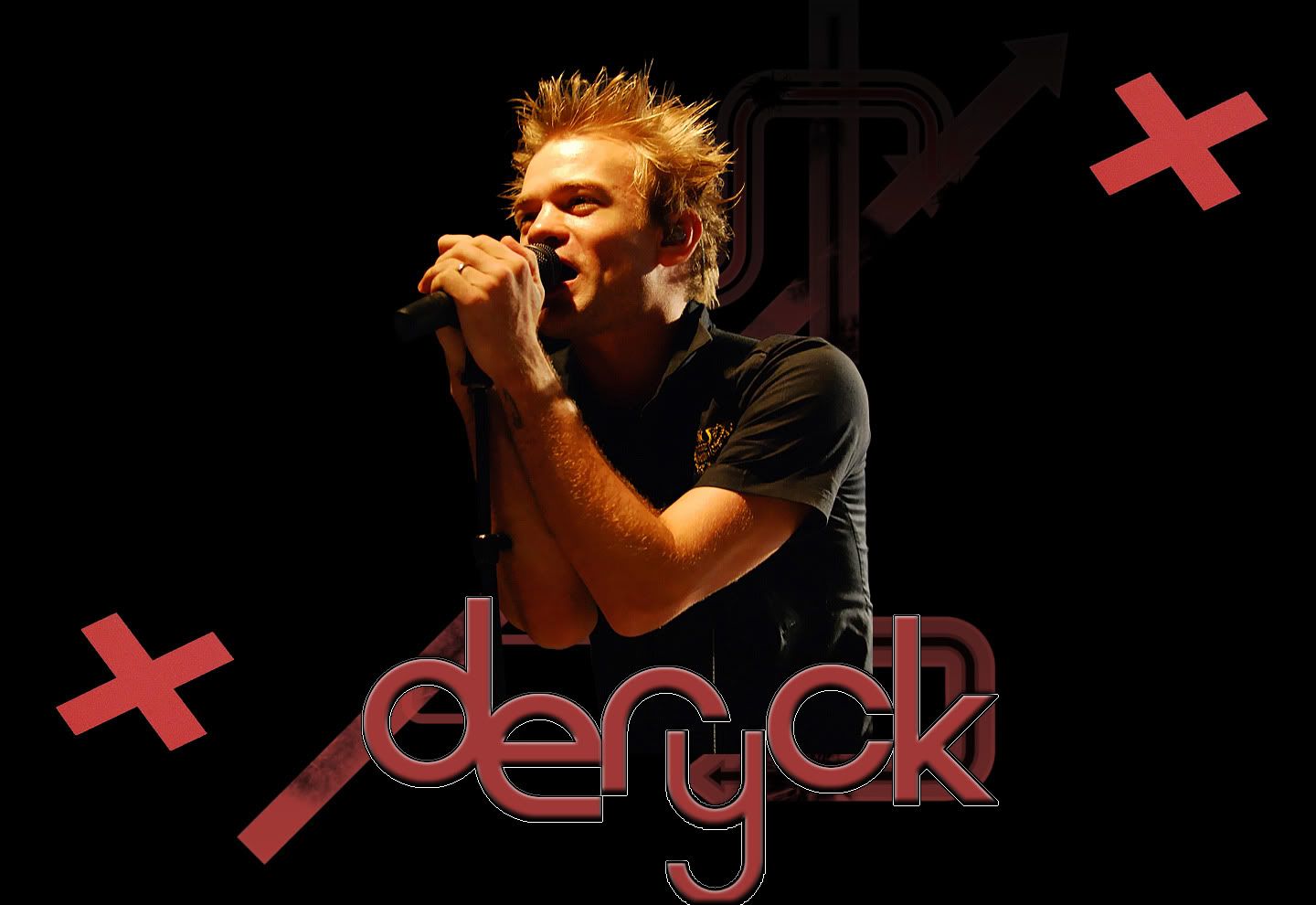
It's been too long, here's a Deryck wallpaper
Posted: Mon May 03, 2010 5:52 am
by Sum41Ant27
So I wanted to make something new. Looks simple, but it took a while getting deryck cut out of the pic. Tell me what you think. I had another one that kinda had an iPod look, but I didn't really like it. here it is. If anyone wants me to resize it I could if you want

 Click to view the fullsize image.http://img.photobucket.com/albums/v155/ ... lpaper.jpg
[/imgwidth]
Re: It's been too long, here's a Deryck wallpaper
Posted: Mon May 03, 2010 6:08 am
by 182sins
It's great, but I don't like the "Deryck" text, it's kind of pixelised. Good job, tho
Re: It's been too long, here's a Deryck wallpaper
Posted: Mon May 03, 2010 6:34 am
by Sum41Ant27
Yeah I know what you're talking about, around the "y" is what kills it, but I tried everything to get it to look better but no luck. :/
Re: It's been too long, here's a Deryck wallpaper
Posted: Mon May 03, 2010 10:14 am
by Jeremy Kill
Great job cutting Deryck out. I hate cutting things out, it's so tedious when they're really detailed, haha. The X's look kind of plain compared to the design in the background. Maybe tatter up the X's a bit around the edges and whatnot so it looks worn out. Color scheme is good. You can't really go wrong with red and black, haha.
Re: It's been too long, here's a Deryck wallpaper
Posted: Mon May 03, 2010 11:19 am
by Jake-41
I love that color of red. If i liked wallpapers, i'd use it.
Re: It's been too long, here's a Deryck wallpaper
Posted: Mon May 03, 2010 1:43 pm
by I'm A Cunt [*banned*]
i despise cutting hair out, especially his. nice job.
Re: It's been too long, here's a Deryck wallpaper
Posted: Mon May 03, 2010 2:17 pm
by FuckT41182
you made it pretty good...but if I should be honest I'd tell ya that I'd use another picture...and removed the X's

but it's your wallpaper and If you like it,then it's cool ;)
Re: It's been too long, here's a Deryck wallpaper
Posted: Mon May 03, 2010 6:59 pm
by Sum41Ant27
I might fix the x's. I took it from his guitar. I tried putting the guitar in, but it didn't fit. I'll try it out when I get home from work.
Re: It's been too long, here's a Deryck wallpaper
Posted: Mon May 03, 2010 7:32 pm
by Gutter Dreams
I like it, except the x's ruin it for me. other than that, a hell of a lot better than I could do.
Re: It's been too long, here's a Deryck wallpaper
Posted: Mon May 03, 2010 8:38 pm
by 182sins
Did you do it on photoshop ?
If you did, you could maybe take some scotch stripes (I don't know where to find them, there might be some on deviantart) and do a cross with it, it would definately look awesum !
Re: It's been too long, here's a Deryck wallpaper
Posted: Tue May 04, 2010 12:35 am
by Max
Nice! I really like it. Very nicely cut out and your composition is great.
I'd be tempted to lose the pixelly white border on "deryck" and just use a stroke in photoshop. Maybe re cut out and re colour the X's as they're a little grainy. Bring in the top X a bit closer and rotate it/shrink it a bit so it's not the same as the other one. You've cut off a bit of the y at the bottom as well. Don't forget that anyone with a start bar will have more cut off the bottom if they fit to screen so maybe bring the whole image up a little.
:)
Re: It's been too long, here's a Deryck wallpaper
Posted: Tue May 04, 2010 2:19 am
by Sum41Ant27
182sins wrote:Did you do it on photoshop ?
If you did, you could maybe take some scotch stripes (I don't know where to find them, there might be some on deviantart) and do a cross with it, it would definately look awesum !
Yup I did it in Photoshop, and I'll try what you said and see how it looks.

Max wrote:Nice! I really like it. Very nicely cut out and your composition is great.
I'd be tempted to lose the pixelly white border on "deryck" and just use a stroke in photoshop. Maybe re cut out and re colour the X's as they're a little grainy. Bring in the top X a bit closer and rotate it/shrink it a bit so it's not the same as the other one. You've cut off a bit of the y at the bottom as well. Don't forget that anyone with a start bar will have more cut off the bottom if they fit to screen so maybe bring the whole image up a little.
:)
Thank you very much, I know what you're talking about with the letters. Funny thing is, those letters are actually brushes, not a text, so when I stroke it it still give me the same problem. I might just get rid of the stroke all together. I'll take your advice and see how it looks from what you said.
Re: It's been too long, here's a Deryck wallpaper
Posted: Sat May 08, 2010 9:04 pm
by Aaron
looks awesome!
Re: It's been too long, here's a Deryck wallpaper
Posted: Mon May 10, 2010 10:43 am
by Capoeirista666
it's cool but yeah, still is work to do on the text