or

or stick with what i've got?


The Forgotten Son wrote:Stick with it, and give the look at me sig to me :D
Code: Select all
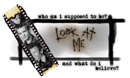
[IMG]http://i163.photobucket.com/albums/t309/vertigogamer/lookatmesig.png[/IMG]Spiderpig wrote:Resize the 2nd one its too big.
thanks :)The Jester wrote:second one
too late given to 'the forgotten son' ;)Zam wrote:First one.
same as i said to 'spiderpig', i'm not a photoshop user much i just use it for gifs. i use macromedia fireworks ;)budgie182 wrote:second one looks great but its really big
thanks, i don't wanna use the first one 'cause i was going through a rough few days when i made it which reminds me of that. the second one is my twist on what the 'walking disaster' cd cover could look like going by the 'underclass hero' onebenroy39 wrote:there both sick, i like the first just becuase it gives off a more sum 41 vibe