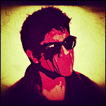
Click to view the fullsize image.http://img.photobucket.com/albums/v155/ ... lpaper.jpg[/imgwidth]
It's been too long, here's a Deryck wallpaper
-
Sum41Ant27

- Half Hour Of POWER!!!
- Posts: 1477
- Joined: Sat Sep 08, 2007 7:34 pm
- First name: Anthony
- Age: 19
- Gender: ♂
- 360 Gamer Tag: Sum41Ant27
- Location: Jersey
It's been too long, here's a Deryck wallpaper
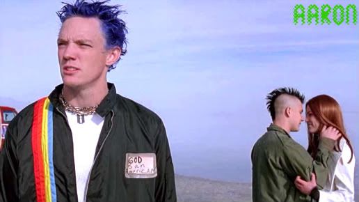
So I wanted to make something new. Looks simple, but it took a while getting deryck cut out of the pic. Tell me what you think. I had another one that kinda had an iPod look, but I didn't really like it. here it is. If anyone wants me to resize it I could if you want 

Click to view the fullsize image.http://img.photobucket.com/albums/v155/ ... lpaper.jpg[/imgwidth]
Click to view the fullsize image.http://img.photobucket.com/albums/v155/ ... lpaper.jpg[/imgwidth]
Last edited by Boni on Mon May 03, 2010 9:28 am, edited 1 time in total.
Reason: Picture was way too big. Click it for full size.
Reason: Picture was way too big. Click it for full size.

-
182sins

- Half Hour Of POWER!!!
- Posts: 1346
- Joined: Thu Jun 28, 2007 5:53 pm
- First name: Cyril
- Age: 23
- Gender: ♂
- Instrument 1: Guitar
- Instrument 2: Vox
- Instrument 3: Piano
- Twitter: @cyril_41
- Location: France
Re: It's been too long, here's a Deryck wallpaper
It's great, but I don't like the "Deryck" text, it's kind of pixelised. Good job, tho
-
Sum41Ant27
- Half Hour Of POWER!!!
- Posts: 1477
- Joined: Sat Sep 08, 2007 7:34 pm
- First name: Anthony
- Age: 19
- Gender: ♂
- 360 Gamer Tag: Sum41Ant27
- Location: Jersey
Re: It's been too long, here's a Deryck wallpaper
Yeah I know what you're talking about, around the "y" is what kills it, but I tried everything to get it to look better but no luck. :/
-
Jeremy Kill
- Moderator
- Posts: 12879
- Joined: Wed May 30, 2007 11:57 pm
- Gender: ♂
Re: It's been too long, here's a Deryck wallpaper
Great job cutting Deryck out. I hate cutting things out, it's so tedious when they're really detailed, haha. The X's look kind of plain compared to the design in the background. Maybe tatter up the X's a bit around the edges and whatnot so it looks worn out. Color scheme is good. You can't really go wrong with red and black, haha.
-
Jake-41

- Underclass Hero
- Posts: 3696
- Joined: Thu May 14, 2009 4:26 am
- First name: Jake!
- Age: 18
- Gender: ♂
- Instrument 1: Banji
Re: It's been too long, here's a Deryck wallpaper
I love that color of red. If i liked wallpapers, i'd use it.

-
I'm A Cunt [*banned*]
- Resident Skumfuk
- Posts: 5928
- Joined: Sat Feb 02, 2008 3:42 pm
- First name: Charley
- Age: 17
- Gender: ♂
- 360 Gamer Tag: KiNGxCRuSaDeRXx
- Instrument 1: Guitar
- Location: South carolina
Re: It's been too long, here's a Deryck wallpaper
i despise cutting hair out, especially his. nice job.
-
FuckT41182

- Resident Skumfuk
- Posts: 5234
- Joined: Fri Aug 14, 2009 3:34 pm
- First name: Jacob(Jism)
- Age: 20
- Gender: ♂
- n00b: my dick
- Location: Slovakia
- Contact:
Re: It's been too long, here's a Deryck wallpaper
you made it pretty good...but if I should be honest I'd tell ya that I'd use another picture...and removed the X's 
but it's your wallpaper and If you like it,then it's cool ;)
but it's your wallpaper and If you like it,then it's cool ;)

Mark: Sometimes when I talk in 3rd person i end up calling tom mark
Tom:Yea than he starts touching me and i think thats masturbation
Some people think were idiots or perverts dont argue were both.
"i think we're gonna be one of those bands thats around forever and even makes records, even if noones buying them and using them for toilet paper...but we'll still make them because we'll be the best fuckin toilet paper anyones ever used...." - Tom Delonge
-
Sum41Ant27
- Half Hour Of POWER!!!
- Posts: 1477
- Joined: Sat Sep 08, 2007 7:34 pm
- First name: Anthony
- Age: 19
- Gender: ♂
- 360 Gamer Tag: Sum41Ant27
- Location: Jersey
Re: It's been too long, here's a Deryck wallpaper
I might fix the x's. I took it from his guitar. I tried putting the guitar in, but it didn't fit. I'll try it out when I get home from work.
-
Gutter Dreams

- Moderator
- Posts: 3141
- Joined: Tue Sep 01, 2009 1:48 pm
- First name: Sarah
- Age: 19
- Gender: ♀
- PSN ID: SarahFTL
- Instrument 1: Guitar
- Twitter: sarrrwhite
- Location: Canada(!)
Re: It's been too long, here's a Deryck wallpaper
I like it, except the x's ruin it for me. other than that, a hell of a lot better than I could do.
-
182sins
- Half Hour Of POWER!!!
- Posts: 1346
- Joined: Thu Jun 28, 2007 5:53 pm
- First name: Cyril
- Age: 23
- Gender: ♂
- Instrument 1: Guitar
- Instrument 2: Vox
- Instrument 3: Piano
- Twitter: @cyril_41
- Location: France
Re: It's been too long, here's a Deryck wallpaper
Did you do it on photoshop ?
If you did, you could maybe take some scotch stripes (I don't know where to find them, there might be some on deviantart) and do a cross with it, it would definately look awesum !
If you did, you could maybe take some scotch stripes (I don't know where to find them, there might be some on deviantart) and do a cross with it, it would definately look awesum !
-
Max

- Dr. Rocco
- Posts: 1016
- Joined: Fri Dec 19, 2008 6:11 pm
- First name: Max
- Age: 33
- Gender: ♂
- Instrument 1: Fender Tele Deluxe
- Instrument 2: Gibson Les Paul
- Instrument 3: Epiphone Casino
- Location: Manchester, UK
Re: It's been too long, here's a Deryck wallpaper
Nice! I really like it. Very nicely cut out and your composition is great.
I'd be tempted to lose the pixelly white border on "deryck" and just use a stroke in photoshop. Maybe re cut out and re colour the X's as they're a little grainy. Bring in the top X a bit closer and rotate it/shrink it a bit so it's not the same as the other one. You've cut off a bit of the y at the bottom as well. Don't forget that anyone with a start bar will have more cut off the bottom if they fit to screen so maybe bring the whole image up a little.
:)
Last edited by Max on Tue May 04, 2010 12:37 am, edited 1 time in total.
-
Sum41Ant27
- Half Hour Of POWER!!!
- Posts: 1477
- Joined: Sat Sep 08, 2007 7:34 pm
- First name: Anthony
- Age: 19
- Gender: ♂
- 360 Gamer Tag: Sum41Ant27
- Location: Jersey
Re: It's been too long, here's a Deryck wallpaper
Yup I did it in Photoshop, and I'll try what you said and see how it looks.182sins wrote:Did you do it on photoshop ?
If you did, you could maybe take some scotch stripes (I don't know where to find them, there might be some on deviantart) and do a cross with it, it would definately look awesum !
Thank you very much, I know what you're talking about with the letters. Funny thing is, those letters are actually brushes, not a text, so when I stroke it it still give me the same problem. I might just get rid of the stroke all together. I'll take your advice and see how it looks from what you said.Max wrote:Nice! I really like it. Very nicely cut out and your composition is great.
I'd be tempted to lose the pixelly white border on "deryck" and just use a stroke in photoshop. Maybe re cut out and re colour the X's as they're a little grainy. Bring in the top X a bit closer and rotate it/shrink it a bit so it's not the same as the other one. You've cut off a bit of the y at the bottom as well. Don't forget that anyone with a start bar will have more cut off the bottom if they fit to screen so maybe bring the whole image up a little.
:)
-
Aaron

- Underclass Hero
- Posts: 3005
- Joined: Sat Dec 13, 2008 12:49 am
- First name: Aaron
- Age: 14
- Gender: ♂
- n00b: ant and turtle
- 360 Gamer Tag: xRG West
- Instrument 1: Trumpet
- Instrument 2: Guitar
- Location: Jesusland
- Contact:
Re: It's been too long, here's a Deryck wallpaper
looks awesome!
"Nice Guys Finish Last" -Leo Durocher
My masters are Still Waiting and Madjid
My Brothers and Sisters are Jake, Sara, and Heather.
My Noobs are Sum41Ant27 turtlehobopirate. My Grand-Noob is GutterDreams.
We have a messed up family :)
My masters are Still Waiting and Madjid
My Brothers and Sisters are Jake, Sara, and Heather.
My Noobs are Sum41Ant27 turtlehobopirate. My Grand-Noob is GutterDreams.
We have a messed up family :)
-
Capoeirista666

- Bunkface
- Posts: 216
- Joined: Sat May 01, 2010 8:46 pm
- First name: Bob
- Age: 21
- Gender: ♂
Re: It's been too long, here's a Deryck wallpaper
it's cool but yeah, still is work to do on the text