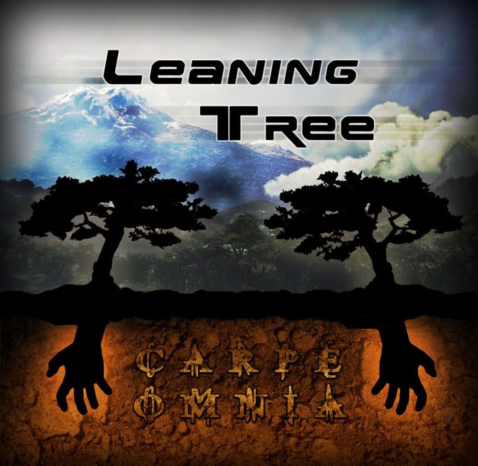
Max wrote:It's not really as bad as you think at first glance. I think the problems are:
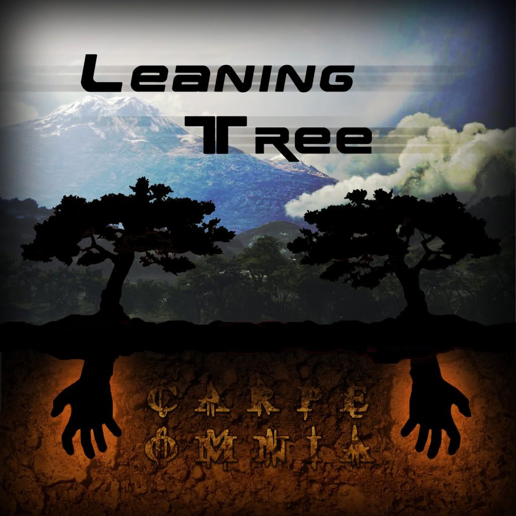
- The "Leaning Tree" text definitely don't reflect a leaning tree where as Carpe Omnia definitely has the right text style.
- It's the wrong size, I've never seen an album cover that's that shape.
- The hands don't look natural. Look at the first finger and thumb.
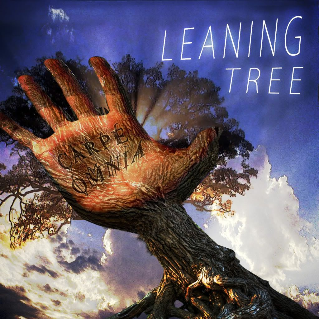
- Carpe Omnia needs to stick out a little more. I'm guessing you've overlayed the text and added a stroke outline, it's nice but needs to stick out more.
- Is the band called Leaning Tree or Carpe Omnia. Obviously I know which one because you've told us but would you be able to tell the difference if you saw it in a shop?
- Do you own any of the images used in the album art or do you have permission of whoever owns them?
Maybe I'm taking this a bit too seriously but at least now you have a couple more ideas to go off.
Also sorry for resurrecting this thread. I didn't realise it was a month old!
Thanks for the feedback, okay first. Yes I agree the Leaning Tree text could be different.
It's the correct size. Did you click the picture which links to the full thing? It's cut off in this post.
The hands should look natural.. It was hard to find a hand in that grasping pose..
The Carpe Omnia text is layered at least twice with a gradient and a stroke yeah.. I really like how it looks. I didn't want it to be too demanding of the cover.
I think it's clear Leaning Tree is the band because of its position at the top and that it's most clearly read.
And about the images.. well I have permission for the jungle background.. it's a uhh.. screenshot from a mission in Halo 3. Legal. As for the dirt.. yeah I stole some rock pattern and turned it brown into dirt. And the hand.. it was a tiny hand in a collage of poses and I overlayed it black so it's not really identifiable. As for the trees.. I found a tree and I tweaked it up pretty good in these two seen here


