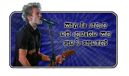
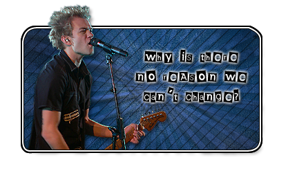
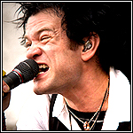
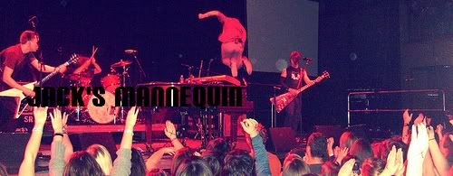
Yup I was bored, even though I have to study for a french quiz tomorrow, I found this more important. Not sure if I'm going to use it, but it's pretty nice. What does everyone think?
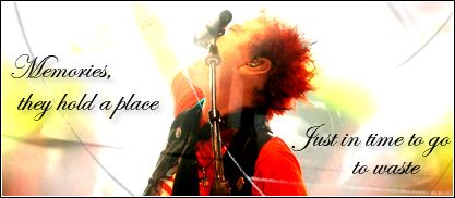
here's another version I did. I think this one is a little better for some reason...
Last edited by Sum41Ant27 on Tue Apr 14, 2009 10:21 pm, edited 1 time in total.
NoReason27 is my mastah.
Kano and Still Waiting are my official n00bs. Mess with them and before you know it you'll be working in Nickelodeon
J-pan, xmarryxx and conspiracyof1000 are my grandn00bs and T. is my brothah
CIRCUITzach wrote:im on vaction HA. nice sig, shoulda got pic of bix in chuck era
lol yeah, but for some reason I don't really like Deryck's hair back then. Anyway I posted another version. I think this one is a little better. I also tried a white, but I think it was too bright. I'm liking this one more.
I like the second one better, and I love the way you cropped out Deryck. Great work!
But I think you should've chosen different lyrics. No Reason is angry-ish. But the colors you chose are cool colors.
So... I dunno. But the sig design is great.
I hope you don't mind constructive criticism.
ReemFTW wrote:
But I think you should've chosen different lyrics. No Reason is angry-ish. But the colors you chose are cool colors.
THIS! this is what i feel. it just doesn't fit. also, i don't think maybe you should've included a modern Deryck picture. considering they don't even play No Reason live anymore, you should've had a Deryck from the Chuck era. i realize it's gonna be a completely different sig if you choose to make these changes.
you have far too much time on your hands
"The missing part of me that grows around me like a cage..."
ReemFTW wrote:I like the second one better, and I love the way you cropped out Deryck. Great work!
But I think you should've chosen different lyrics. No Reason is angry-ish. But the colors you chose are cool colors.
So... I dunno. But the sig design is great.
I hope you don't mind constructive criticism.
I don't mind constructive criticism at all. Like I said, I like Deryck how he looks now. The lyrics, well anyone got any suggestions? I just love that song so much. Also I think it might look better with the background (the blue part) to be a little smaller. There's a lot of empty space between the lyrics. I might do this. For now it's fine. Oh and the font, well I love that font so that's staying.
Yeah I think the font and picture and background is fine, but if you want to make a No Reason sig, I'd suggest you use colors like red or orange or yellow, you know, warm, bright colors...
As for the lyrics, I don't know. What songs by sum are your favorites?
I got the prefect lyrics now. I'm gonna fix this up tomorrow. I have to study for a french test tonight. And by study I mean play Guitar Hero with my french book next to me!


oh i like that song from SoCo.